Week 2: Brand Identity and Brand Image
What is Brand Identity vs. Brand Image?
Brand identity is the accumulation of the organization’s name, logo, brands, taglines, service attributes, offerings, and all other outward-facing elements of the organization. These elements should be reflective of the organization’s mission and values. Overall, the uniting factor is that all of these disparate pieces are created by the company themselves. As seen in the diagram above, the brand identity is shaped by not only its outward expressions, but also those pointed inward. The brand image, on the other hand, is more of a group effort. Paul Argenti, in his book Corporate Communication, defines image as “...a reflection of an organization’s identity. Put another way, it is the organization as seen from the viewpoint of its constituencies.” (2016). The brand image may look different to different groups or may have many images for a single group. The goal is to have the brand identity and image closely aligned, as the purpose of a cohesive brand identity program is to form a brand identity. Thus, a successful brand identity should be judged by how well it matches the brand’s image.
How important can they be for a new brand?
As stated above, the brand Identity should reflect the values of the organization and the mission that the company seeks to fulfill. Thoughtful alignment and consistency are key within the brand group. Once the identity is built, it’s up to the public to judge its worth. Brands live and die on the public’s perception of the brand’s image. This is especially important for a new brand, as image is a prime factor in cementing a product into the public consciousness.
Comparison of different brand identity models

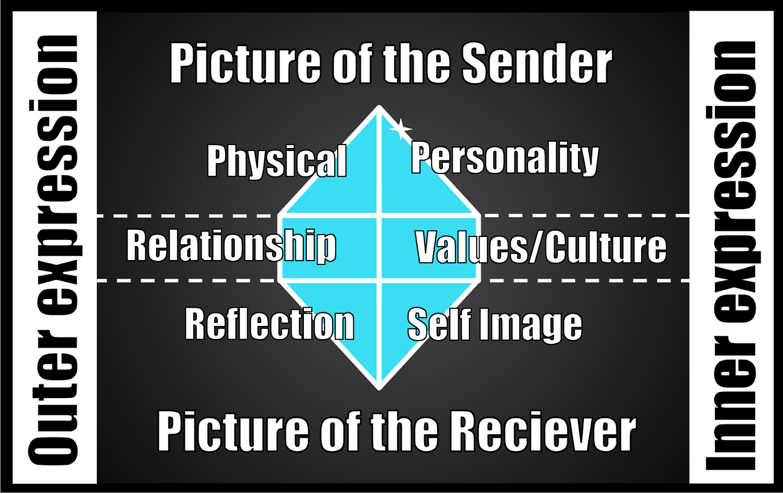
Kapferer’s brand identity prism (2012).

de Chernatony’s Components of brand identity (2010)

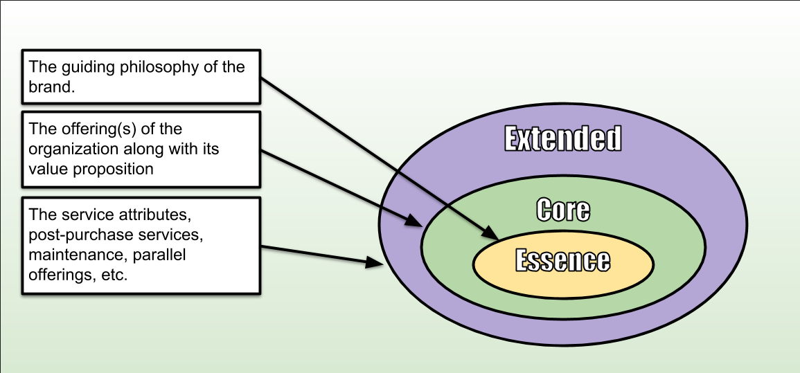
Adapted from David Aaker’s Brand Identity System (1995)
In the figures above we can see a few different viewpoints of brand identity. While they may differ, they are mostly congruent with one another. Kapferer's (2012) “prism” sits squarely in-between Aaker’s (1995) “core” and “extended” concentric circles with “inner expressions” (right) finding a home in the “core” and “outer expressions” (left) sitting in the “extended”.

A second interpretation of Aaker’s model (1995)
If we take a slightly different take on Aaker’s model we can see that Kapferer’s model and Aaker’s model become more or less the same. Just concentric circle vs. a dissected prism, with Kapferer shading in details and Aaker providing a bigger picture. Leslie de Chernatony’s model stays in line with the concepts provided by the distinguished gentlemen while shedding more light on the relationships between all employees and various stakeholders.
How is visual identity based on the brand identity?
Visual identity helps to paint the picture of a brands identity in the minds of its customers. Elements such as the color pallet, trade dress, employee uniforms, logos, etc. all work to form a more holistic view of the brand and help to invoke an emotional response in the customer. In an article titled 'How Visual Brand Identity Shapes Consumer Response' in the journal, Psychology & Marketing, the researchers note that a viewer can identify a Target commercial long before any logos or copy is present. The article goes on to state that strong visual brand identity promotes a sense of familiarity and congruency in the customer’s mind and creates a “tertium quid”, Latin for “third thing”, that creates something larger than the sum of its parts. (Phillips, McQuarrie & Griffin 2014). John Balmer of the Bradford School of Management warns us that:
“The corporate identity/concept was not only used as a surrogate for “image management” but has been viewed by some authors, such as Dowling (1994), as being fundamentally concerned with visual identity.” (Balmer 2001).
Thus, stating that there is a common mistake in putting the VBI cart before the culture horse.
Brand Identity Analysis
Let take a look at Target through the lens of Aaker and Kapferer. I once had the pleasure of touring Target’s world headquarters in my hometown (Minneapolis) a few years back and was a regular customer when I was still living stateside. Thus, I will be attempting to analyze them through my own first-hand experience.
For the sake of expediency, I will be using the second version of Aaker’s model (below).

Target briefly mapped onto Aaker’s brand identity system
For Kapferer’s model well go with a list:
Outer expressions
More upscale than the direct competition (Wal-Mart), justifying the slightly higher price point. Socially and politically Liberal in content and actions.
Physical:
Bright, clean & colorful (predominantly Target-red)

Brand identity is the accumulation of the organization’s name, logo, brands, taglines, service attributes, offerings, and all other outward-facing elements of the organization. These elements should be reflective of the organization’s mission and values. Overall, the uniting factor is that all of these disparate pieces are created by the company themselves. As seen in the diagram above, the brand identity is shaped by not only its outward expressions, but also those pointed inward. The brand image, on the other hand, is more of a group effort. Paul Argenti, in his book Corporate Communication, defines image as “...a reflection of an organization’s identity. Put another way, it is the organization as seen from the viewpoint of its constituencies.” (2016). The brand image may look different to different groups or may have many images for a single group. The goal is to have the brand identity and image closely aligned, as the purpose of a cohesive brand identity program is to form a brand identity. Thus, a successful brand identity should be judged by how well it matches the brand’s image.
How important can they be for a new brand?
As stated above, the brand Identity should reflect the values of the organization and the mission that the company seeks to fulfill. Thoughtful alignment and consistency are key within the brand group. Once the identity is built, it’s up to the public to judge its worth. Brands live and die on the public’s perception of the brand’s image. This is especially important for a new brand, as image is a prime factor in cementing a product into the public consciousness.
Comparison of different brand identity models
Kapferer’s brand identity prism (2012).
de Chernatony’s Components of brand identity (2010)
Adapted from David Aaker’s Brand Identity System (1995)
In the figures above we can see a few different viewpoints of brand identity. While they may differ, they are mostly congruent with one another. Kapferer's (2012) “prism” sits squarely in-between Aaker’s (1995) “core” and “extended” concentric circles with “inner expressions” (right) finding a home in the “core” and “outer expressions” (left) sitting in the “extended”.
A second interpretation of Aaker’s model (1995)
If we take a slightly different take on Aaker’s model we can see that Kapferer’s model and Aaker’s model become more or less the same. Just concentric circle vs. a dissected prism, with Kapferer shading in details and Aaker providing a bigger picture. Leslie de Chernatony’s model stays in line with the concepts provided by the distinguished gentlemen while shedding more light on the relationships between all employees and various stakeholders.
How is visual identity based on the brand identity?
Visual identity helps to paint the picture of a brands identity in the minds of its customers. Elements such as the color pallet, trade dress, employee uniforms, logos, etc. all work to form a more holistic view of the brand and help to invoke an emotional response in the customer. In an article titled 'How Visual Brand Identity Shapes Consumer Response' in the journal, Psychology & Marketing, the researchers note that a viewer can identify a Target commercial long before any logos or copy is present. The article goes on to state that strong visual brand identity promotes a sense of familiarity and congruency in the customer’s mind and creates a “tertium quid”, Latin for “third thing”, that creates something larger than the sum of its parts. (Phillips, McQuarrie & Griffin 2014). John Balmer of the Bradford School of Management warns us that:
“The corporate identity/concept was not only used as a surrogate for “image management” but has been viewed by some authors, such as Dowling (1994), as being fundamentally concerned with visual identity.” (Balmer 2001).
Thus, stating that there is a common mistake in putting the VBI cart before the culture horse.
Brand Identity Analysis
Let take a look at Target through the lens of Aaker and Kapferer. I once had the pleasure of touring Target’s world headquarters in my hometown (Minneapolis) a few years back and was a regular customer when I was still living stateside. Thus, I will be attempting to analyze them through my own first-hand experience.
For the sake of expediency, I will be using the second version of Aaker’s model (below).
Target briefly mapped onto Aaker’s brand identity system
For Kapferer’s model well go with a list:
Outer expressions
More upscale than the direct competition (Wal-Mart), justifying the slightly higher price point. Socially and politically Liberal in content and actions.
Physical:
Bright, clean & colorful (predominantly Target-red)
Big

Proprietary, red shopping carts and baskets

Red shirts and tan khakis worn by all employees

Relationship: Easy and friendly
Hassle-free returns

Employees accompany the customer to find a product

Target RED-card benefits

Reflection: All designed to be appealing to the middle and upper-middle-class

Personality: Quirky and fun


Culture: Friendly and liberal

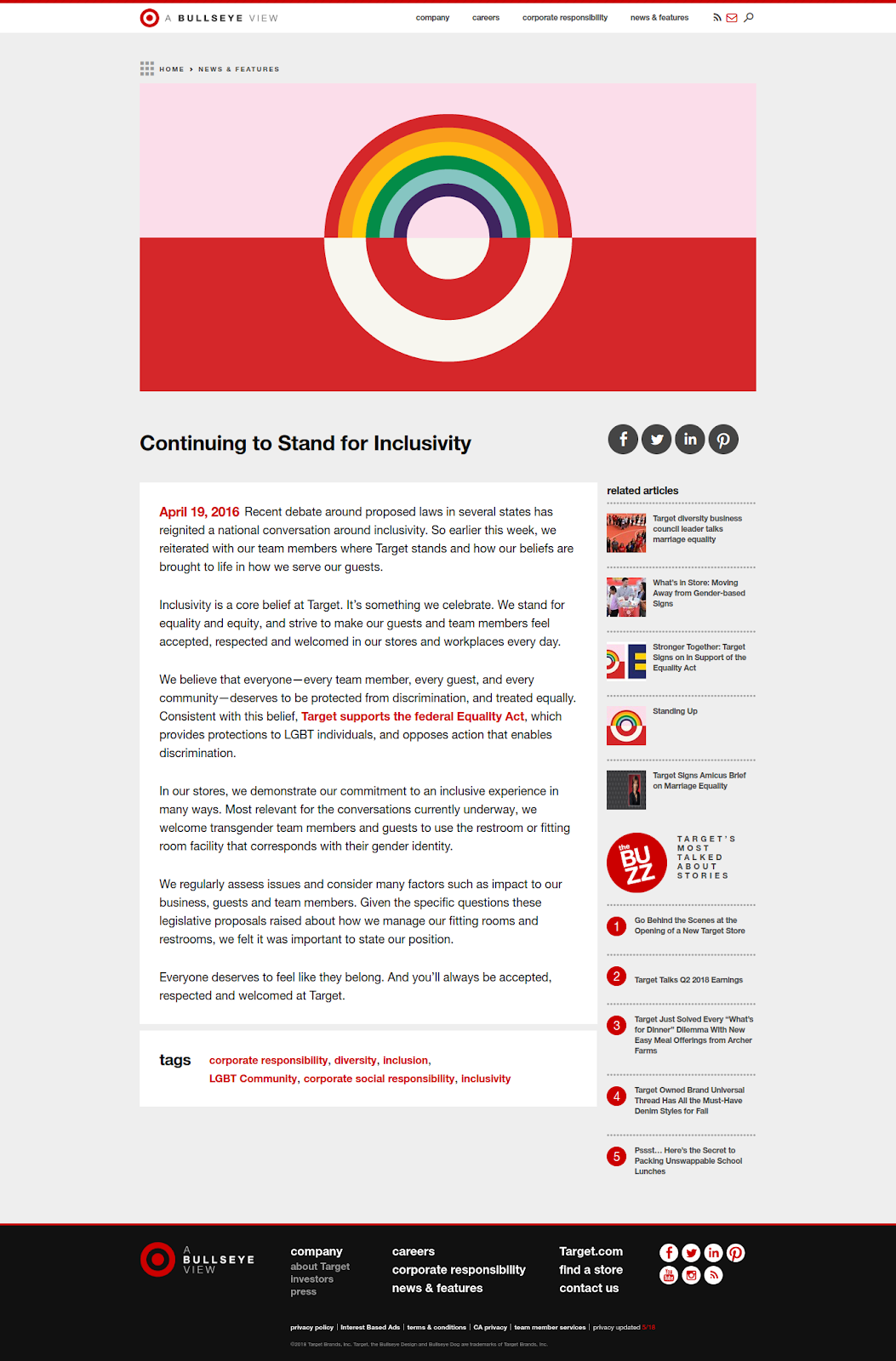
https://corporate.target.com/article/2018/06/pride
In 2016, Target openly opposed transgender bathroom-ban legislation pushed forward in North Carolina. Read the whole statement below:


Aaker, D. 1995. Building Strong Brands. New York: Free Press, pp.85-103.
Argenti, P. 2016. Corporate communication. 7th ed. Boston: McGraw-Hill Irwin, pp.73-94.
Balmer, J. M. 2001. Corporate identity, corporate branding and corporate marketing - Seeing through the fog. European Journal of Marketing, 35(3/4), pp. 248-291.
Proprietary, red shopping carts and baskets
Red shirts and tan khakis worn by all employees
Relationship: Easy and friendly
Hassle-free returns
Employees accompany the customer to find a product
Target RED-card benefits
Reflection: All designed to be appealing to the middle and upper-middle-class
Personality: Quirky and fun
Culture: Friendly and liberal
https://corporate.target.com/article/2018/06/pride
In 2016, Target openly opposed transgender bathroom-ban legislation pushed forward in North Carolina. Read the whole statement below:
Target also seemed genuinely interested in taking care of employees at the headquarters with amenities such as:
(They wouldn’t let me take pictures--use your imagination)
- Bike storage rooms staffed with bicycle mechanics.
- The building across the street was purchased and renovated to be a open recreational/workspace with basketball courts, pinball machines, foosball, lounge chairs, yoga classes and a number of other fun amenities.
- Showers in the office for those that exercised on their lunch break or biked to work.
Self-image
The self-image created in the mind of a Target shopper is one of savings coupled with associations of style, class, and open-mindedness.
Thanks for your time. We’ll see you next week.
Sources:
Aaker, D. 1995. Building Strong Brands. New York: Free Press, pp.85-103.
Argenti, P. 2016. Corporate communication. 7th ed. Boston: McGraw-Hill Irwin, pp.73-94.
Balmer, J. M. 2001. Corporate identity, corporate branding and corporate marketing - Seeing through the fog. European Journal of Marketing, 35(3/4), pp. 248-291.
de Chernatony, L. 2010. From Brand Vision to Brand Evaluation. 3rd ed. Amsterdam: Butterworth-Heinemann, p.54.
Kapferer, J. 2012. The new strategic brand management. 5th ed. London: Kogan Page, p.158.
Phillips, BJ, McQuarrie, EF, & Griffin, WG 2014, 'How Visual Brand Identity Shapes Consumer Response', Psychology & Marketing, vol. 31, no. 3, pp. 225-236. Available from: 10.1002/mar.20689. [3 September 2018].
Target Corporate. (2018). Continuing to Stand for Inclusivity. [online] Available at: https://corporate.target.com/article/2016/04/target-stands-inclusivity [Accessed 3 Sep. 2018].
Thanks for sharing this amazing informative post with us i found this helpful for best branding agency promote growth for our clients by reshaping consumer decision-making and experiences through brand, corporate identity design, branding, content and technology. brand identity design
ReplyDeleteThanks For the Blog Brand Identity
ReplyDeleteWeek 2 focuses on understanding the differences HostGenics between brand identity and brand image, emphasizing their roles in shaping consumer perceptions and loyalty.
ReplyDeleteThis is a great post on brand identity and brand image! In the fashion industry, high-quality visuals are essential for creating a strong brand presence, especially for footwear brands. Clear, professionally edited images help showcase products in the best possible way, making them more appealing to customers. A professional footwear photo editing service ensures perfect lighting, background enhancement, and retouching to highlight every detail. Well-edited images not only boost engagement but also increase sales in eCommerce and marketing campaigns. Thanks for sharing these insights—looking forward to more branding discussions!
ReplyDeleteThank you so much for sharing this informative post. Really i got exact information what i was searching Brand identity design to know about our service.
ReplyDeleteA professional trade show booth design company in Las Vegas truly makes a difference when it comes to attracting foot traffic and building brand authority on the show floor. Trade show exhibit and booth builder company
ReplyDeleteI really appreciate how this week emphasizes the subtle yet powerful difference between brand identity and brand image. It's fascinating to see how a brand can craft its identity intentionally, but the public perception—its image—can evolve in ways even the brand didn’t fully predict. Woman With Us is providing fitness, fragrance, glasses, bags, jewellery, shoes, accessories, school supplies, clothing & apparel deals and discount codes. This made me realize how consistency, authenticity, and clear messaging are key to shaping how customers perceive a brand over time.
ReplyDelete